
Pattern Mixing Guide: Why It Feels Intimidating (and Why It Shouldn’t)
I used to freeze at the fabric store, but after learning this pattern mixing guide, I now confidently combine prints. Mixing patterns is one of the most fun, budget-friendly ways to make a room feel collected.
With a few simple rules, you can combine stripes, florals, and geometric prints without any design degree.
This pattern mixing guide will walk you through seven actionable tips that turn your space into a confident, cohesive masterpiece. Let’s dive in!
This guide is designed for anyone who loves pattern but feels unsure. By the end, you’ll be mixing prints like a designer.
Start with a Common Color Palette
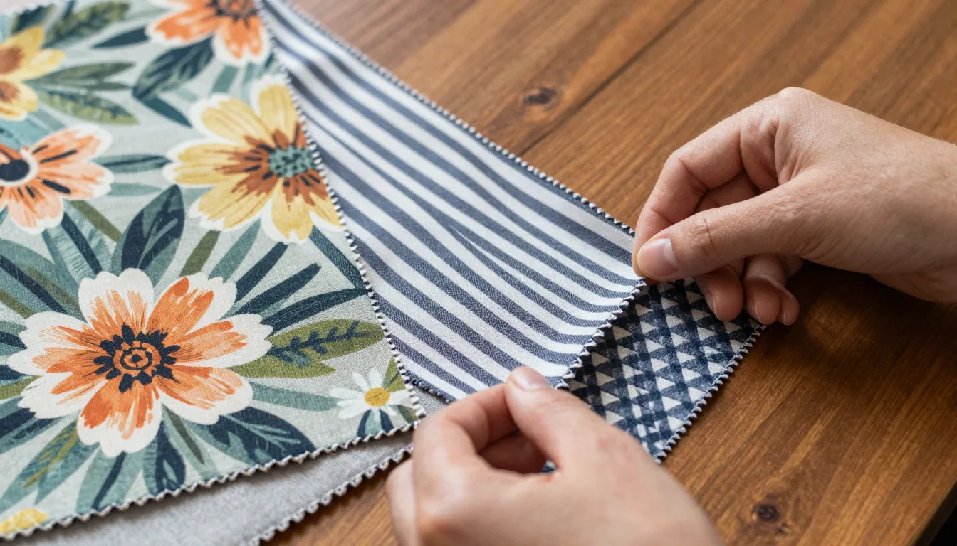
The easiest way to make different prints work together is to anchor them in the same color family. Choose two or three colors that repeat across your patterns.
For example, a navy-and-white stripe, a floral with navy accents, and a geometric print in navy and blush pink.
This doesn’t mean every pattern must use exact shades—just that there’s a unifying thread. A consistent color palette acts like visual glue, making even wild combinations feel intentional.
Pro Tip: Use Neutrals as a Base
If you're nervous, start with neutral backgrounds like beige, gray, or white. Add pops of color through your patterns.
This keeps the look grounded and gives your eyes a resting place.
For instance, a bedroom with floral bedding, striped curtains, and a geometric rug can look cohesive if all patterns share a soft blue and white palette. This approach works in living rooms as well, where a striped sofa and floral pillows can coexist.
Vary the Scale of Your Prints
One of the biggest secrets in this pattern mixing guide is playing with scale. Pair a large floral with a small-scale geometric or a medium stripe.
This creates contrast and prevents your eye from getting overwhelmed.
Avoid using all large-scale prints, as they can overwhelm a small room. Instead, mix sizes for balance.
Mix Different Pattern Types
Combining the same type of print can look flat. Instead, pair organic patterns (florals, botanicals) with geometric ones (stripes, chevrons, triangles).
The contrast between curvy and angular creates dynamic tension.
For example, an ikat-inspired floral on a throw pillow looks stunning next to a herringbone throw blanket. Or mix a classic stripe rug with a tropical leaf-print curtain.
Use a ‘Rule of Three’ for Balance
When layering patterns, aim for three different prints: one dominant (large floral on a duvet), one secondary (medium stripe on curtains), and one accent (small geometric on a pillow). This gives a clear hierarchy and prevents chaos.
Don't forget solid colors—they act as breathing room. A solid-colored couch or wall lets each print shine.
For example, in a dining room, you might use a striped tablecloth, floral placemats, and geometric napkins. This rule is a cornerstone of any reliable pattern mixing guide.
Add Texture for Depth
Pattern isn't just about visual prints—texture counts too. A chunky knit throw, velvet pillow, or linen curtain adds interest without adding another print.
This is especially helpful with bold patterns.
Texture makes a space feel inviting. Run your hand over a woven basket or wool rug; tactile sensations make pattern mixing cozy rather than chaotic.
Adding texture enhances the principles of this pattern mixing guide.
Consider layering textures like a cotton slipcover with a chenille throw or a wool rug on hardwood. The interplay of different materials adds a luxurious feel without extra patterns.
Test Before You Commit
Before buying, lay out your pattern choices together on a floor or table. Take a photo in natural light and see how they interact.
This step saves costly mistakes and helps adjust balance.
You can also use online tools like the pattern-mixing feature on Houzz or pin photos side by side. Trust your gut—if it feels off, swap one pattern out. Testing is a step often overlooked in a pattern mixing guide, but it’s crucial.
Many home decor websites offer virtual room mock-ups. Upload your pattern choices and see how they look together in a 3D space.
Try Digital Visualization Tools
Websites like Houzz and Pinterest let you create mood boards. Upload pattern images and see them together before buying.
This saves money and ensures harmony.
Some apps even allow you to photograph your room and overlay patterns. This gives you a realistic preview of how prints will look in your space.
For more inspiration, check out this Better Homes & Gardens pattern mixing article. It provides additional examples and tips.
Budget-Friendly Hack: Repurpose What You Own
Look through your current decor for patterns you already love. A scarf can become a throw pillow cover, and a tablecloth can become a curtain.
Even on a budget, this pattern mixing guide can transform your space.
Confidence Is Your Best Accessory
The number one rule is to have fun. There's no 'wrong' way if the result makes you smile.
Start small—maybe with a striped rug and a floral armchair—and build from there. Ultimately, a pattern mixing guide is just a tool—your creativity leads.
You can also start with a small space like a powder room or a reading nook. This low-risk approach lets you experiment without overwhelming your entire home.
Remember, interior design is about expressing your personality, so go ahead and put that plaid pillow next to the paisley throw—you’ve got this! For more ideas, check out our Home Decor & DIY section.

